Showing posts with label OUGD101. Show all posts

Sunday, 22 November 2009

No News is Good News: Message & Delivery

The next project was an extension of the last one. We had to create a mail shot, incorporating the three posters that we created for the last brief. Again we were set a similar task at the beginning, and told to create five open questions, five closed questions, five statements of fact and five statements of opinion. An incredibly interesting fact that I discovered, was the the fact that you can only become psychologically addicted to ketamine, not physically. I thought this was a great little bit of information that not many people would know, and it also tied in nicely with the brain illustration that I had drawn previously. We were told to address the 'What, Why, How, Who?' first, before we started to design anything technically. This required a lot of brainstorming and thinking, something which I hadn't experienced much of in the past. However, I sat down and did what I needed which led to me being able to compose an appropriate mailing list of recipients for my mail shot. It ranged from health clinics to youth hostels. Once I had all the written information that I needed, I started to design my envelope and the information that would feature on the inside. I had previously decided that it would 'Inform' my chosen target audience and therefore would not be as sarcastic and intimidating as my previous designs. I wanted to keep the same colour scheme and basic features, including my designed typeface and brain illustration.

We were given a very bland manilla enevelope that we were told we could do anything with, basically completely redesign it. As long as the dimensions were kept the same and it could fit throught the post box it was OK. I decided to flip the envelope from landscape to portrait, that way adresses would fit on the front better. I also made it so no glue was required to hold the envelope shut. I settled on having my flyer landscape, so that it would fold simply out of the envelope, after looking at paper folding designs that were just too complicated. I also decided that aswell as having a fold out flyer, a small information card would also be contained inside. This way a person who needs the information straight away and all of the time can carry the card around with them.
Below is the final design of my fold out flyer. It would be glued temporarily down, so that its steady enough not to escape the envelope when being transported, but can be removed by the recipient to put up and display.

No News is Good News: Message & Interpretation

We were told to a wide variety of research relating to any article of our choice taken from a newspaper sold on Saturday 17th October. I chose an article about a young bot who killed one of his best friends whilst under the influence of a horse tranquiliser, ketamine. I chose the article because I felt there was a lot of scope and it is a subject matter that resonates with a lot of young people in this day and age. I chose to research the effects and risks that come with drug misuse and found a lot of interesting information. In our first taught session of the week we were given a very short period of time to think of ten verbs, ten adjectives, ten symbols and ten objects. At first I did not see the point of the task, but then we were told that we would have to create three very simple posters in the space of a week. One poster had to be solely image, another solely text and the last had to be a mixture of the two. I was initially stumped as to where I could take this but then I remembered an artist I have been influenced by before, Saul Bass. His work is incredibly simplistic and often uses just two to three colours. After looking at several different examples of his work I went back to the ten objects I had drawn in the first session to see what I could do with them. I discovered that I had drawn a brain and a syringe, and therefore I would try and combine the two to create an effective image based poster. I had to think of a piece of text that would fit onto the purely type poster and came up with the phrase: 'Tried Ket Yet'. It rhymed and also posed an almost rhetoric, sarcastic question, which I feel was the tone appropriate for a piece of this nature. However this couldn't be the only thing featured so I also decided to list a few of the more serious side effects associated with Ketamine misuse. After working on composition for a while I had finally designed three posters that I was happy with. Now came the difficult bit, I had to decide on the correct colour scheme to go with. Because the brief had specifically asked for the final pieces to only contain two colours, plus stock I knew that colour choice would be important, and not just an after thought. I experimented with metallics, pastels, different shades of the same colour and came across many options that I felt worked and I would have been happy using. However I could not settle on a definate combination until I came across the mixture of a sickly yellow and a bluey green. It was perfect. By hvaing the juice that was leeking from the brain an almost poisonous colour, it reinforced the message of damaging your brain even more. And the way in which it complemented the blue/green was perfect.

My final three compositions:

Wednesday, 21 October 2009

Alphabet Soup Part Two

I started off this project by interviewing the partner selected for me from the 'randomizer'. We were given 10 set questions that we had to ask our partner, and then answer personally as well. The questions ranged from incredibly personal; 'What is your most treasured possesion?', to more light hearted; 'What would be your fancy dress costume of choice?'. Initially we had no idea what we would have to do with the information, therefore I tried to get as much as I could. Once we were finished we were then told we had to design a complete alphabet that visually communicates them and their interests. At first I was quite overwhelmed and could not figure out how I would manage to represent a person I had never spoken to before, but once I settled on a theme I was set.

I decided to use one of my partners biggest interests; tattoo's, and expand on the idea. I researched 'Sailor Jerry', one of the founding tattoo artist's, and his infamous traditional designs. I wanted to incorporate these designs with a pre-existing font but realised I couldn't just place the drawings with the font as this would not answer the brief correctly. In order for it to be done correctly I had to edit the font, not just place illustrations with it.
Above is a quick example of how I printed off pre-existing fonts and then drew over them to create a more traditional feel. Once I settled on using Arial Narrow as the existing typeface I then worked on a larger scale so I could add better detail to each letter. I then worked on the illustrations that I could pair with the letters, initially wanting to go with a traditional rose I sketched a few designs.
This is an example of how I paired the rose design with the letter A. Also featured is the cut-out on the right hand side stroke and serifs. Now I had to decide on where the rose would feature on every other letter and the glyphs. Below is the sheet that I took into my final crit. I was pleasantly pleased with what I had created and hoped it wouldn't be too heavily criticised. Luckily it wasn't but a few issues I had expected to be raised were. For example from a distance it was hard to decipher that the roses where actually roses because of the dark red colour, this would need to be addressed. Another issue was the continuity of the serifs, but I knew I hadn't looked into it thoroughly enough, and expected repercussions.

Therefore I decided to remove the colour and all the serifs that were unecessary to create what you see below. My absolute final alphabet.

Sunday, 4 October 2009

Alphabet Soup: Part One

On Monday 28th September the class was given a new brief entitled 'Alphabet Soup'. Each person was given a word to visually communicate, mine was: 'Dissect'. I found myself stumped as to what to do with this word, so I decided to brainstorm a few ideas and just try to come up with something interesting. I started by looking at the actual definition found in the dictionary and found this:

Dissect:
1. To cut apart or separate
2. To examine, analyse or criticise in minute detail


I decided to follow the first definition and literally pull apart my letters. Once this idea had come to the forefront of my mind I instinctively thought of the traditional Channel 4 ident. The idea that the number 4 had been split up and pulled slightly apart, making it appear disjointed really appealed to me and addressed the brief perfectly. I then started to look at different type faces, exploring many different ones but eventually landing on Arial Black. The boldness of it was perfect and when using upper case letters the thickness of all the lines was ideal for 'dissecting' them in half.

I could not decide which 10 letters to use for this project so I used a 'randomiser' similar to the one used to assign the word 'dissect' to me in the first place. The 10 letters I picked were: A,E,H,X,N,V,Y,L,K,Z. With my final 10 letters I decided to trace each one and then work over the top with experimentation. I split each line in two and then also added serifs in certain places. Once my final typefaces had been designed I printed them off and used a scalpel to create 'stencils'. With these stencils I experimented with different materials including felt and foamboard.

I scanned all different letters into my computer with all different colours of felt.

I liked the solid colour approach but I also liked the idea of combining a few different colours. So I decided upon using the primary colours red, yellow and blue. Once I had designed all ten letters using my primary colour format I could have finished the project then and there. However I decided to take the design one step further. I remembered that I liked the 3D approach of the Channel 4 ident and so used photoshop to distort the perspective of my designs. Each one was given a slant so I could put another layer behind, this one would be black to communicate the 3D design.

Below are a few examples of my final design:

Monday, 28 September 2009

How to... Meet people with similar interests?

Monday 21st September was the first real day of the course and everyone was thrown into the deep end.

Groups were assembled randomly to come up with a solution to a proposed problem, ours being: 'How to meet people with similar interests?' The rest of the people that I would be working with for the next week were:
Tom Bates, Brian Cantwell, Arthur Carey, Naomi Farrar, Kirsty Hair and Meryem Meghraoua
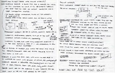
The initial stages seemed to be a little static, with members maybe feeling a little apprehensive about expressing their ideas. In order to combat this we each carried out an individual brainstorm to come up with as many ideas as possible. My brainstorm looked like the following:

Photobucket

This was followed by a collaboration of ideas and finally an ideal solution to the problem we faced. The solution came in the form of different coloured wristbands that 'freshers' would wear on their first day/week of term. Each colour represents a different subject area that the client would wear dependant on their interests. For example if a person liked listening to music they would wear a yellow wristband, however if they liked playing sport they would choose a green coloured one. We thought this was a good idea as it made it possible for people to identify beforehand who had the same interests, and therefore avoid the often awkward introductions to new people.

This was not were the idea stopped however. After some research we came across silicone wristbands that were also USB sticks. They are available in hundreds of different colours, including the ones we had assigned to our nine categories. When it became clear this was the definate approach we wanted to take, it was decided we would create documents that could be put on each wristband. Information contained within included: an invitation to a mixer event specific to the area of interest, designed by Meryem, and a map that highlighted all areas of interests within Leeds, designed by Naomi.


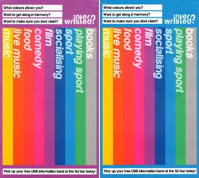
My key role within the group was to create posters that would visually advertise what the basics of our solution were. I decided they would have to be bold and contain all the colours of the nine wristbands and their respective categories. Another imperative feature for the poster was the display of the logo, designed by Naomi, but created by Tom. Below are a few examples of the final design:

Photobucket