
For my next step in creating my 5 X A2 presentation boards I decided to go back to paper and pen and experiment with layout. I decided I would use my blue and pink colours to create strokes at opposite ends of the page. I also decided to place the page number above the top strokes and to the left, keeping them as small as possible. After my final crit I realised the type layout wasn't great at the bottom, as the length of line was far too long. I helped to correct this by splitting the text into columns, two to be more specific. Below are my revised drawings of what I am aiming for.


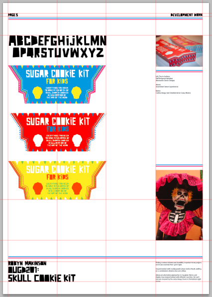
Once I had layout ideas in my head it was then all about finding the appropriate imagery. I had to take my final assembled product and capture it from all different angles. Some shots have far more detail than others, which are simplistic and straight to the point. I worked on a simple grid system, as I feel too many lines can be distracting and due to the large amount of variations it can almost look as if there was not grid to begin with. I revised my board intentions and settled on the following themes: board one - product shot, board two - opening the package, board three - the internal contents, board four - in context within a kitchen and board five - a little bit of development. Below are screen captures of my five final boards with the grid lines I worked with also visible.


No comments:
Post a Comment