After brainstorming ideas in fifteens, from things you collect to people you find inspirational, I narrowed my path down to tattoos. Once I had the subject matter chosen I had to find 100 facts, 100 opinions and 100 items related to tattoos and the tattoo process in general. This research involved secondary, which I did through the internet and books that specialise in the history of tattoos, and primary, which meant I posted an online questionnaire and a hand held survey that I distributed for responses. I managed to collect 50 opinions through both the survey and questionnaire. Below are three examples survey responses:

I kept the questions simple on purpose so as not to overwhelm the recipient and put them off the idea of getting across their opinions. I was very intrigued by the responses and the wide variety of feelings that people have. Some went into a lot of detail as to why they detest the idea of permanently scarring their bodies, whereas others simply stated 'awesome'. I would say that the general consensus was 50/50, half liked them and the other half didn't.
In terms of facts gathered below are a few choices that I found most interesting:
- The term tattooist was coined by Sutherland MacDonald who wanted the public to respect tattooing as an art form rather than as a simple craft
- The Japanese created the Horimono style in just 100 years
- The oldest evidence of tattooing dates back some 5300 years, with Otzi the Iceman discovered in the Austrian Alps
- Felix Leu was the first tattoo artist to create the morphed tattoo machine, an idea which has spread and inspired people everywhere
- A tear tattoo can be symbolic of murder, with a new tear added for every death
Once I had all the things I needed to embark on this new project I was then asked to categorise the items according to certain methods. I struggled to organise the items and facts and opinions themselves so instead I categorised the tattoo's themselves and brainstormed a few ideas like below.

It was hard to come up with a few more ideas than the ones you see above and kept struggling to categorise the facts and opinions I had gathered until one day I just sat down with some highlighters and a scrap piece of paper and picked up keywords and themes that ran through the information. I managed to get 100 successfully, some include: regret, sailors, western culture, afraid, desire, piercing, prison, statement, remembrance, lifestyle, ritual, nostalgia etc. Obviously the list goes on until 100 but the rest are similar to the ones just mentioned. Once I had compiled this list of 100 I had to figure out a way to come up with a product that combines atleast five of these themes. With this project, through my initial research, I had come to the conclusion that people still discriminate against people with tattoos and this was something that I wanted to address. So I began to think about people who wouldn't normally go to get tattooed and brainstormed 100 different professions. This list of professions included things like mathematician and lawyer, respectable jobs that upstanding members of the community would only have. It was then my aim to design 100 different tattoo motifs for these 100 professions, each one following the traditional route, with roses and banners prominent. Below are just two examples of 100 Tattoos I have designed. They are targeted at a 'chef' and a 'bank robber' respectively.

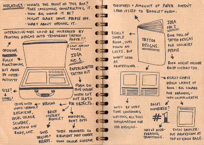
 It took a very long time to design 100 tattoos, but once I had these designs I then had to think of a way of compiling these designs into a way that was successful.
Brainstorming was difficult because I couldnt think of a more interesting way to compile the information other than simply putting them all together in a large book. Because my idea at the time was to still have the designs printed onto temporary tattoo paper the book form favoured this. However after my first crit I was told that this idea wasn't liked and instead I should make the designs into a Tattoo Artist Reference Book. I liked this idea and it opened the whole process up for me. From here on I divided the professions into categories, for example: customer services, public services, practical skills, sport, the arts and miscellaneous. I colour coded the categories and grouped the specific designs together. I then decided that I would have to use some sort of tab system so that the product is as simple and effective to use.
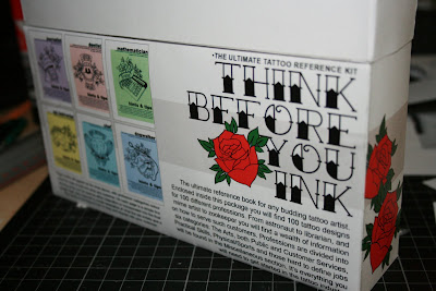
 Once I had designed the box and net I then had to cut it out and assemble it to see if it actually worked. The box did and each compartment did aswell, along with the acetate which covered each group of designs. However the outer design on my box was not well received in my final crit. I was told that it was too plain and simple, and it didn't actually tell the recipient what the product inside was. You just couldn't tell from the outside, in fact you would have to open it up to even get an inkling and this was no good therefore I started to re-design the outer packaging straight away. I knew that I wanted to keep the title and the splashes of colour with the addition of red roses, however I needed to have more written information and maybe even a snapshot as to what the pages look like on the inside.
 Above is an image of how my product looked at the stage of my final crit. I can now see that it is simply too plain and the purpose is not clearly evident from the outset. Also the lettering on the front is hand rendered, something that I now regret doing, and will never do in the future. I used a computer generated font for labelling the compartments on the inside, and therefore do not know why I chose to hand draw the most important bit of text on the whole product. I started by composing the correct sized net on photoshop and coming up with some simple differentiations on the same basic idea. I played around with font size, yet always knowing that 'Think before you Ink' needed to be big, and the position of the roses. I also changed the format of the box itself. Before it had a hinge on the back and the top simple swung open, however this proved difficult when I tried to close the box for good. It would never shut properly and was therefore a real problem. For my absolute final resolution I had it so it was a simple bottom and a top that slides off. I also made it so when the top is off, the bottom is low enough so the labels for the compartments are visible. Below are a few ideas of my re-designed product and package.


I really like this and think that the packaging work effectively as a way of keeping the designs together and categorising them. Would it have been necessary to include any colour guides for the tattoos?
ReplyDelete