Showing posts with label OUGD103. Show all posts

Thursday, 27 May 2010

Speaking From Experience: Seven

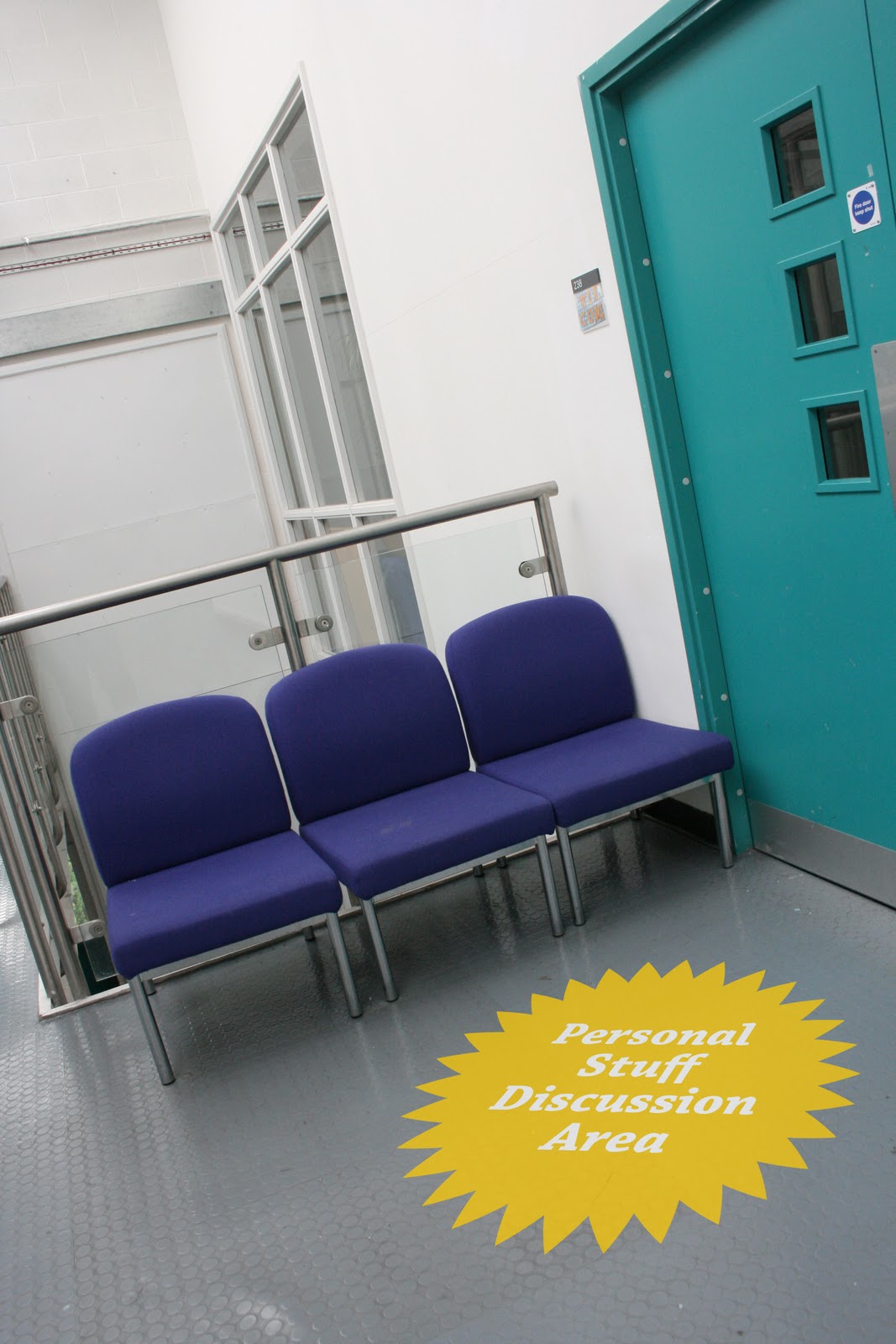
At my final crit on Friday I was told to expand on my idea in a non print way. So I decided to capture some imagery that depicts my proposed idea in an actual environment. I thought about placing the cardboard cut outs in several areas around the college but soon realised that this wasn't the direction I wanted to take. The aim of the cut-outs is to attract the students right at the beginning of the day when everyone is in a communal area, the canteen perhaps. They would then pick up an information pack which they would read and begin to understand the aims of these discussion areas. Then for the rest of the week there would be large vinyl stickers placed sporadically around the college, with each ones colour defining what should be discussed in that area. Obviously I have not had time to create the actual stickers so I used photoshop to create examples of this approach, they can be found below.


Tuesday, 25 May 2010

InDesign Brief: Final Composition

Below are the final compositions for my double page spread. I first started by creating the text that would go with the article. I decided to go with the idea of a simple, yet informative, article that dealt with all the things my partner had experienced in the first year. Ranging from successes to failures, nothing is too personal to mention. I then went on to place the text in the actual DPS. I decided to use two columns on each page because it split the text up neatly, and therefore doesn't appear too overladen with text. I used the font Chaparral Pro for the small print and Doergon for the larger stuff like headlines and quotes. At this point I realised the article had no visuals so I immediately began to remedy the situation. I started by getting a large scale image of Ellis that could be used as the main focus. I then realised that this fit nicely above the two colums of text and decided to just go with it. Also because the article is about work I thought it would be appropriate to include some pictures taken from her blog. These were then scaled down and placed along side the information on the 'Collection 100' brief. Once all this was done I figured that my article would have to have some sort of headline, I therefore decided on a simple play on words replacing the word 'Alice' with 'Ellis.'

Below are a few examples of colour experimentation that I did before hand, before ultimately deciding to go with the blue.


InDesign Brief

I was partnered with Ellis and asked her the following questions, to which she gave me great responses. I think the information I have gathered, paired with visuals I can take from her blog will make for a great, well-rounded article.

Age: 19 - born 21/02/91

Accomodation: Broadcasting Tower Leeds

Why did you pick graphic design?
I was quite academic at school and got high grades in all subjects. I found graphics really interesting and some what of a challenge for myself because it was one of my weaker subjects.

Why this course in leeds?
It has a good reputation and I liked the high standard of work seen on the open days. I knew it would be one of the harder more intense courses that I had looked at, but yet again wanted to push myself to work hard.

What qualification you did before here? Where you went to study it?
York College - Graphic Design Diploma - Distinction

What has been you're favourite brief and why?
I enjoyed the collection 100 as I like the end product I came up with. It was hard because of the amountof work expected, however I think I organised my time best with this project as the project was on something that interested me.

What has been your most successful end product?
Communication is a virus - Get people to try something new - Working with Roz and Becky Tipping - John thought our idea was good enough to show to Sainsbury's.

What you have not enjoyed?
I've hated researching and getting all the little bits of information together which backs up work. Although I understand the necessity, this doesn't take away from the hours spent doing it and finding a million other things to do instead before hand.

Are you a fan of blogging?
I HATE BLOGGING! It takes so much time. You think you just need to upload a few simple pics and two hours later you've managed to find 100 other things that need sorting out.

What products have not worked as well as you thought?
The very first project - How To - We created more of an idea rather than a product.

What you thought about the extra stuff like electives and CTS?
Photography elective was a waste of time because the teacher wasn't even a photographer herself she was a sculptor. CTS was a bit of a joke aswell because we were being taught by someone who was still drunk from the night before. He said I needed help with me writing skills, then I changed a few spelling mistakes and he said my essay was the best in the class.... hmmmm.

What have you created for the what is a line brief?
I did mostly sketchbook work and couple ideas but not a final thing. It was an art installation which doubled up as individual business cards which made up the whole image.

What have you created for the speaking from experience brief?
I have created a calendar tackling issues with people spending their student loan too fast.

Have you enjoyed the year?
Yes, it has probably been the most eventful year of my life!

What are you looking forward to next year?
Living in a house with people that don't annoy me! Having more freedom with briefs.

What are your aims for the next year?
To create alot more work that I am proud of.

Is there anything you would do differently if you could go back?
I don't like to regret things, because everything happens for a reason and you can't go back, so I just like to learn from my experiences.

Obviously some of the information above isn't quite fitting for the article, therefore I'll have to summarise what it is she is getting across. I think I am going to go in the direction of a cheesy article that deals with Ellis' experiences within the first year. It's going to be informative and all the information displayed will be 100% real, I'm just going to play around with tongue-in-cheek phrasing and composition.

Speaking From Experience: Six

Here are my final designs for the accompanying websites to my project. I have kept the designs simple but have continued using the aspects that can be seen in all the other work I have produced for this brief. The colours are used in a subtle way along with the chosen font 'Chaparral Pro'. I have never created a website design before so this task proved challenging but I thought as long as I use my other pieces for inspiration I can't go wrong. The information presented is all the same with just slight differences in colour and image. I thought using a web layout would be helpful in me presenting other ideas that I had thought of during the brief. For example screen printed t-shirts and a separate pack for accommodation where things I really wanted to do but found myself short on time. I think if the project where to continue or become a real idea, then those are the directions that it could go.


Monday, 24 May 2010

Speaking From Experience: Five

I have now finished creating my final range of products and am ready to present the results in front of the rest of the year group. Below are the three final front designs for the informative pack, as you can see the information has been kept minimal with the illustrations playing a pivotal role. The image below that one shows the exact same three packs, but instead the backs of them. Again the illustration is present but there is a lot more information on show. It tells the potential customer of what is contained within the pack and also for them to keep a look out for the 'cardboard cut outs' that I am designing. It mentions that these cut outs signify the position of a 'communication area' targeted specifically at that area of discussion, whether it be small talk, personal stuff or topical banter. You can also see the presence of the 'burst' graphic, I thought it would be nice to include this as it pops up in several places inside the pack. It's also a great place to place type inside of.


After I had put together the packs I then went onto designing the large scale cardboard cut outs. Before now I had been just using the heads of these characters and nothing else. I had not actually designed the bottom halves, and as someone with limited illustrative skills this posed somewhat of a problem. However I did manage to create full figures, with a little help from online imagery, and continue with the process. I decided to place all three on an A1 sheet so that they were a substantial size without costing the earth. I placed the 'burst' graphic behind their top halves and also placed in the subject of conversation which they represent. Below is an image showing the three characters after I had cut them out from the print out, but before I mounted them to create a rigidity which would mean they could stand up.


Below is an image depicting the large scale cardboard cut outs stood up with their corresponding information pack placed directly below them. This is roughly how I imagine the real situation would look when presented in specific areas around the college. Obviously though the three would not be all together, they would be separate in equally spaced areas.


Below is a close up image depicting the front of an individual pack. I hope the image shows the crispness of the print out and how the newsprint stock works really well with the chosen colour scheme. As you can see the cover has been kept simple with as little information on as possible. By including a question on the front it also draws the reader in and hopefully wills them onto to using the items inside. I also like the subtle use of the lines across the designs, and if you turn the pack over the lines carry on, creating a sense of continuity.


Below is the contents of the pack placed around and photographed. You can see a series of prompt cards, a name badge, a mystery item page of information, a double sided information leaflet/poster and the empty pack itself. I like the range of products would but say that there is always room for more. I always wanted to include a t-shirt with the character illustration screen printed on but with the decision to create an envelope rather than a box, one simply wouldn't fit. I could maybe include something to promote a website that can be accessed where more information is available. This is definitely the direction that I want to take and will start to create possible layouts for a website.


Below is an image of my final designs for the prompt cards, printed and backed with a speech bubble pattern. To the right of the cards is the simple belly band I created to hold them all together. I didn't want to detract from the detail of the cards themselves but I did want some way of the customer being able to identify what they are. So I used the circular 'burst' graphic in the appropriate colour with the phrase written in white, bold, italic type. I think its a really simple idea but it adds a degree of professionalism and realism to the product.

Speaking From Experience: Four

At this point I have realised that creating a pack in the shape of a box will be too difficult. Mostly because of time constraints and the inability of myself in booking a print session well in advance. Therefore I have decided to create a paper envelope pack instead. Something along the lines of a 'Don't Panic' pack is what I am thinking now. If you think about it, this change in design could actually be beneficial because students don't want to carry out a big box with them on the first day, they've already got so much other, more important, stuff to look after. With a simple, lightweight pack they can pick one up with ease and fling it in their bags. Also this means that they could maybe pick one of each up if they fancied trying all types of conversation.

Below is the final layout for the information side of my double sided leaflet/poster. The idea is that it is folded in five different places to create an interesting way of opening it, not your average; fold in half, fold in half again etc. This just adds an extra aspect of intrigue and individuality in design. The top layout is for the Small Talk category and therefore has the colour red shown throughout. This is carried through to the other two designs, except anything that is red on this one is either yellow or blue on the others.


When it is all folded correctly the first page you will see is the one with the largest face in the middle with the title placed above. This then leads you to open it, where the second page is the one to the right of the first on the layout below. On this page is a little introduction and a table of contents. There is also a red box with inversed white type telling you what to do if an awkward silence creeps up. This red box is continued onto the other page in the double page spread with the other half giving you advice on what to do with your mystery item. This then leads you to the back page where you are given several 'exit lines' and a wish of good luck from your chosen character. Each one specific to that characters attitude and interest.


When the leaflet is unfolded in its first position you are presented with more information running horizontally across the top and bottom. Here you are educated on the other two available conversation subject areas you can explore and a little profile on each of the characters. Here you are also told some key catch phrases to remember that will keep you calm in a conversation and a little personal message from your chosen conversationalist. Once you have read this information you can then unfold these flaps to reveal the poster on the back side.


Below are the designs for the posters in relation to each specific character. As you can see the designs are kept simple with the main focus being the illustration of the character. Below you will find a small blurb about each one, almost a profile on each one naming their strengths and weaknesses within communication. Around the illustration are several speech bubbles with possible conversational snap shots that would appear in that specific area. They aren't meant to be taken seriously, they are meant to be tongue-in-cheek. You wouldn't really say some of the things in those bubbles.
Below are the final designs for another product found within the pack. I thought it would be useful for each one to contain a series of 'prompt cards'. They would be a handy size so you can carry them around and pull them out at any point that you feel the conversation is drying up. I thought it would be better to keep the designs simple, but making sure that the appropriate colours feature heavily along with a small image of the character illustration. Next to this is just a small bit of type listing a few separate ideas for conversation. The cards would be double sided with a repeated speech bubble pattern on the back side. These bubbles would of course be in-keeping with the colour schemes.

The series of prompt cards for the Small Talk category.


The series of prompt cards for the Personal Stuff category.


The series of prompt cards for the Topical Banter category.


Well now I have the majority of finished designs for products within the pack. I still want to design a name badge type thing and also decide whether I will be placing an actual mystery item inside each pack or a piece of information about the mystery item. This may be better because if I settle on a thin paper pack it limits my possibilities for the items. With the other way I can use anything as long as I find appropriate information.

Thursday, 13 May 2010

Speaking From Experience: Three

After I was happy with my ideas for the posters composition I decided to print them off on different coloured stock to see which one works best. For every project I have done so far I have used plain white matt or shiny paper for my final images, this time I am sure I am going to use a different stock, I'm just not sure what it is yet. I experimented with newsprint, sugar paper and brown wrapping paper. I think I like the thick newsprint the best as it has more texture than the plain white but doesn't lose the information like the brown paper does.


I have experimented with all three characters on the paper and have definitely decided to go with the thick newsprint. Therefore from now on I know that everything I print and what to put in my final pack must work well on that type of stock.

Speaking From Experience: Two

Now I have allocated my three different conversational topics I can get on with the graphics side and start actually designing different aspects. At first I continued to experiment with cardboard and 3D mock-ups of what my final mail-shots could look like, until I couldn't think of any other alternatives. After I had done this I realised that I hadn't actually definitely decided what was going into these packages so I brainstormed for a while and came up with my list of items that would be packaged up and how these items would be found within the mail-shot. However this is still up for negotiation, depending on how much time I have left and if I even have the skills and supplies to craft some of the objects. I do really like the idea of there being a unique 'surprise item' within each package though, in the same vain as a kinder egg toy. I think it's the little touches that really make a product worth while, whereas at the same time it does serve an actual purpose of being a 'conversation starter' or even something so mention if an awkward silence arises and you want to quickly remedy the situation.

From the list of items that I want to include within my package I think it would be wise to crack on with the development of one of the bigger pieces; the poster/informative leaflet. So i found myself stumped when it came to where I wanted to take this visually. All I knew was that I wanted to use the colours red, blue and yellow to represent the three conversational topics and that speech bubbles had to play some part. So I started by playing around with my new favourite designing tool, Adobe Illustrator. I thought of the idea of using people faces combined with the speech bubble idea to create visuals that were similar to a cartoon. I started by tracing a face with the pen tool and keeping it as simple as possible. Below is the first example that I created, and considering I had never even attempted anything like this before with Illustrator I was incredibly proud of the final results. I thought by adding a speech bubble with something possibly humourous in it, it could be a good design for a t-shirt, and it would of course be instantly recognisable by other people with the same emblem. Think of t-shirts with someone like Stewie from family guy and you will understand the direction I am coming from.

Like I said I do really like this idea, but it took an awful long time to do because I am not fully averse with all the Illustrator shortcuts and what not. Therefore it may be too difficult to create several different ones. So instead I looked at hand drawn illustrations. Even though this again is not my strongest area it is definitely something that I want to experiment with until I get stronger and stronger. I decided that I would create a character for each of the three subject area's I have decided to use, this would therefore mean all I had to do was draw three different faces. A task that should be well within the realms of my capability.


Above are the three final characters I have created. Each one will be assigned to a specific subject matter. I am thinking that from top to bottom it will go; small talk, personal stuff and topical banter. I don't want to create stereotypes but I have tried to create characters that somewhat relate to their assigned subject. For example the female is someone who may want to talk in more detail about important matters, whilst the small talk guy seems quite superficial and smug and the topical banter man looks well informed and looks like he would be able to carry himself well in a fiesty debate. I think these illustrations would look good placed on a t-shirt or composed right in the middle of a large scale poster. However, more development is obviously required still.


Speaking From Experience: One


I started this project in a very laid back manner. By that I don't mean I haven't been putting the effort in, I simply mean that I want to identify a subject matter, but after that I just want to carry out research and gather as much primary material together as possible, which would mean I can make an informed decision as to where to take the project. So, the subject area that I chose was methods of communication, more specifically 'Small Talk'. Once I had the idea in my head I started to do some research and found a wealth of information over the internet. The information was mainly 'who, what, when and where?' and there were also a lot of pages giving advice as to how to prepare yourself and what conversational paths to follow. One of the more interesting pieces of research I found was three examples of possible conversational scenarios, and a step by step guide as to what to say. I thought to myself would somebody seriously read this and follow the advice shown, because I found it quite tongue in cheek and found myself laughing at the ridiculous things that were being mentioned. For example It told you to never mention things like divorce and illness when first meeting someone new, but surely people realise that. Then it struck me there had to be a reason for this site existing and maybe some people really do struggle that much, therefore I decided to adopt the idea of making a 'Small Talk Survival Guide'. In it would be all the advice you need to survive the first days of the course and how to cope with meeting fifty new people that you are expected to work with for the next three years.

I liked the idea initially and thought there where plenty of interesting directions that I could take it. For example layout and composition would play a very important role, for I had the idea of making it entirely type based and using different sizes and styles. I used the book 'Whatever you think, think the opposite' as inspiration and began to come up with a few initial page ideas. However it soon hit me that I was moving far to fast, it had only been a week and I was thinking of the final piece, so I stopped myself and went backwards a bit. A crit with John also helped me realise that I shouldn't be so two dimensional and should try thinking of more creative ways to answer the brief. I brainstormed for a whole day, just thinking of al the idea's I could, which I could narrow down and really consider at a later date. However, one idea that really stood out to me straight away was the design of furniture designed to enhance the whole 'Small Talk' experience and how this furniture would fit into a 'communication area'. I knew I wanted to use the speech bubble shape as inspiration so I stepped away from the sketchbook and started to craft some 3D pieces that could experimented with and analysed. I created a few separate ideas for furniture, including tables and chairs and photographed the end results. These images where then put into my computer, from where I edited them to create visual variations, playing with colour and different phrases. Below is a scan from my sketchbook showing some of this experimentation.


After deciding this was the direction I wanted to go with this project I thought it necessary to write myself a redefined statement of intent so as to document where I was going and to avoid confusion with anyone who was following my project. Below is that redefined brief:


After this I started to look at the greater picture, rather than just the designs of the furniture I wanted to envision the setting where it would feature. So I sketched a few ideas and also looked at the different ways in which this information would then be communicated to my target audience. I came up with the idea of a mail shot being the idea with the greatest chance for success so I started to look at nets and layouts that would be the most effective. Below are a few pages from my sketchbook showing some of more my developed ideas. From left to right it shows the 'communication area' layout, to how this will be shown on a print out, to how that will be distributed to my intended target audience.


After having a very brief conversation with John I realised the idea wasn't working as fully as I wanted it to do. He mentioned something about someone he knew who when they first met someone, would somehow know everything about this new person within ten minutes. I thought it was interesting point and made me realise that my focus had been too small and I would have to expand on the subject matter to create a more well rounded idea that could actually work. Therefore I thought about conversational techniques and distinguished the difference between three main methods/topics that the majority of people go straight to. These three identified topics are:

Small Talk - Which is usually the discussion of less interesting topics, keeping it light and fluffy, the weather, niceties and polite expressions, almost superficial. 
Personal Discussion - Talking about your life, things you like, personal preference, can get quite deep, discover a lot about your conversational partner and their background.
Interesting Debate - The discussion of relevant topics, things in the papers and on the news, your take on current affairs, can get quite heated and argumental.

Sunday, 14 March 2010

Communication is a Virus

 Today we were asked to compile four lists. These included: our skills and personal attributes, and what skills and attributes we looked for in an ideal partner.

My Skills:
Research, Composition, Photography, Punctuality, Time Management
My Personal Attributes:
Reserved, Sarcastic, Tolerant, Easy Going, Honest
Your Skills:
Illustration, Concept Builder, Commitment, Knowledge, Experimental
Your Personal Attributes:
Confident, Outspoken, Humourous, Punctual, Decisive

We were then told we had 45 minutes to compose a poster similar to a personal advertisement. It had to be A3 and include all the information that we had previously written. When everyone had created their poster, they were all pinned up on the wall anonymously. Then with as many post-its as we wanted we had to put our name on the advertisements that appealed to us. When everyone had done this we went back to our initial posters and made a list of the names that were on them. We then had to go to each person and ask if they wanted to partner up with you. The first person I went to was Karl, and coincidentally I had placed my name on his poster too, therefore we thought it would be a great idea to work together.

After establishing our partnership we immediately got to work brainstorming ideas, both collaboratively, and individually. We decided to take two issues each and start to work on resolutions and directions in which to take each idea. I decided to research 'tell a lie convincingly' and 'get people to communicate more'. I started by simply placing the phrases in a bubble and placing ideas around them. The off shoots ranged from fully formed ideas to as little as key words and further questions. However I found myself struggling on my own, as I didn't know how well my ideas would be received, this may have something to do with my decreased confidence in my own work. Never the less I continued to research and thought that the best direction to go was with getting people to communicate more.

When we came back togather though it became obvious that we were both going in opposite directions and we really needed to do was regroup. Therefore we settled on a definite problem and decided to just make the most out of it, even if we were struggling we just had to power through. The problem we settled on was 'Get people to read more.' The statement of intent that we set ourselves from the beginning went along the lines of:

We have decided on 'get people to read more'. We have decided upon this because there is already plenty of research and statistics out there that we can use to our advantage. We don't want to just promote reading im general, we want to target our campaign at commuters, to brake up the monotomy of the journey they have to take every day. We also want to remove the influence of 'The Metro' and other similar free newspapers.


Because we now knew our target audience we could find a way of directing our message straight at them. We decided to use the National Rail map as a reference and through further research we narrowed down the ten most popular train stations. These stations were: Manchester Picadilly, Glasgow Central, Kings Cross, Leeds, Canterbury West, Bournemouth, Edinburgh Waverly, Cardiff Central, Norwich, Portsmouth and Cambridge. From the names of the different stations Karl started to research the famous literature that has come from that particular area. It was at this point that we realised we could add another dimension to the project: the promotion of new technology and how that can increase the popularity and availability of classic novels.

This also enhanced the 'virus' part of the brief, an aspect that I fully admit had not thought about until now. The final ten stations had to be assigned a piece of literature that could be deemed worthy of reading on commutes on a daily basis. The ten books in relation the stations went as followed:

Manchester - A Clockwork Orange
Glasgow - Peter Pan
Kings Cross - Frankenstein
Leeds - Jane Eyre
Bournemouth - Lord of the Rings
Canterbury - James Bond
Norwich - Black Beauty
Portsmouth - Oliver Twist
Cambridge - The Hitchhikers Guide to the Galaxy
Edinburgh - Sherlock Holmes

Now we had an audience and a context we could start to work on design and composition. We both took five books each completely at random and started to draw out early ideas. The five that I got where Black Beauty, Peter Pan, Frankenstein, Sherlock Holmes and The Hitchhikers Guide. We decided to take memorable quotes from each of the books and pair an illustration with each of these to broadcast on the large scale billboard ads that would feature at every train station specific the area. Below are the final ten designs that we settled on. The first five are Karl's designs.


The next five are my designs. I realise my illustrations are a lot simpler than my partner's but I just can't draw like that, and thought by creating illustrations that are true to my style then I was bringing my own personality to the project.


The purpose of these posters is to attract the commuters eye on a journey they will travel almost every day. Therefore commuters can often grow weary and tend to not really take anything in, thats why we chose bright eye catching colours. They may seem jarring at first but atleast that means they will carry out their intended function. Once we have drawn in the commuters eye, they will then we drawn to a website were they can enter the code found on every poster. This will then lead them to a taster novel, wetting their appetites almost, drawing them in and hopefully leaving them wanting more. Along with the website which can be accessed using the wi-fi available on most trains, other aspects have been included. Such as an application for the iPhone and eBooks for use on eReaders. Below are the three pages designed by Karl for the website. As you can see the theme is continued through the use of purple, orange and white and the typeface Nilland. I think they work incredibly well and are definitely functional.


Below are my designs for the iPhone application. I chose to depict three different stages in the downloading of the novels. The first is purely visual and shows the selection of books available, but obviously you would be initially directed to the particular novel that corresponds to the code you enter. The second is a brief description of the authors life and other works they may have created, on this page is a link to the free downloadable content. The third is the first few pages of the actual novel. This is to entice readers in and hopefully lead to them buying the rest of the novel.