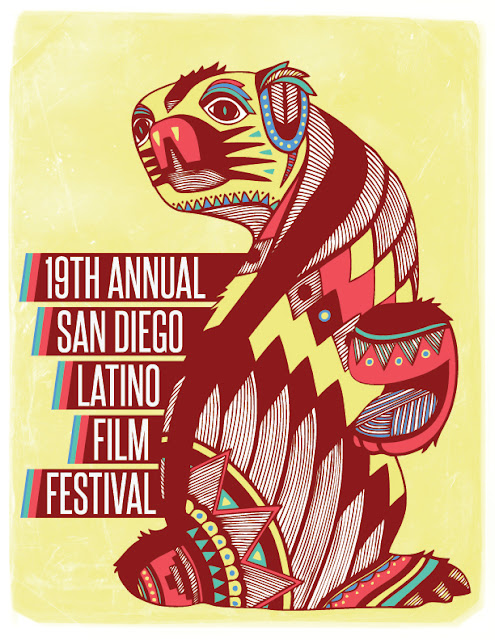
In order for me to get back into the mindset of designing after a few days away from it I decided to attempt a resolution to a live brief that I noticed several weeks ago. The brief itself is a simple poster design aimed at film fans of the Latin/South American genre. I thought this was perfect in terms of my interests in subject matter and to some extent a visual style. I have attempted a few 'Mexican' themed briefs in the past and thought I could draw from my experiences and jump straight into this one with pre-set visual inspiration all in the forefront of my mind. I started the brief by visiting 'Kuler' and tried a few different colour combinations. I wasn't quite sure what I was looking for but I knew the colours had to be bright and engaging. One of the key aspects of the brief was to attract people to look at the poster; the basic principle of any good poster design. Below is flip book of a few of my favourite colour combinations I came across.
I then went straight into illustration design. I knew I wanted to base the design on a traditional form of Mexican scultpure/figurines known as 'Alebrije'. Many images and a brief back story of alebrije can be found here. I started with an initial outline and then used just the one pen to expand on it until the 'figure' was completely covered in pattern. Below is a scan of the finished illustration (pre digital enhancement).
After the illustration had been scanned in I then used the live trace tool in illustrator to turn it into a vector image. I was happy with the digital outcome, but there was one thing missing; colour. I thought about the ways in which I could inject colour into the drawing, but ultimately settled on the method seen below in the flip book. With only five colours to choose from I spread them equally within the drawing trying to achieve the best composition I could. Below are close up snap shots of what I achieved within the day of development.
After settling on an appropriate colour scheme and in turn an application of the colours to the drawing I then went on to add some type to the composition. Below is a screen shot of the way in which I decided to add text. I am not one hundred per cent on the final combination of all the components, but I am certainly nearing completion on this quick one day brief I have set myself.


No comments:
Post a Comment